

Most people arrange furniture the same way: push everything against the walls, centre the coffee table, and hope it looks right. It rarely does — and the reason is almost never the furniture itself.
There’s a furniture arrangement rule that professional interior designers apply to virtually every room they work on. It doesn’t have a catchy name. It doesn’t trend on Pinterest. But it’s the reason some rooms feel immediately comfortable the moment you walk in, and others feel off in a way you can’t quite explain — even when everything in them is objectively nice.
The rule is about visual anchoring and conversation zones: the deliberate creation of contained, human-scaled groupings within a room rather than furniture that lines the perimeter like a waiting room.
This article breaks down exactly what that rule is, why it works neurologically and spatially, how Canadian homeowners can apply it in common room layouts, and what mistakes to avoid. No renovation required. Just a willingness to pull your sofa away from the wall.
Why the “Push It Against the Wall” Instinct Is Wrong
It feels logical. More floor space in the centre means more room to move, right?
Not quite. When furniture hugs every wall, the centre of the room becomes dead space — a void that nobody uses and that makes the room feel like a hallway. Conversation becomes awkward because people are seated too far apart. The room looks furnished but doesn’t function as one.
| Furniture Against Walls | Furniture Floated Inward |
|---|---|
| Centre of room feels empty and unused | Centre becomes an active, functional zone |
| Conversation requires raised voices | Natural conversational distance maintained |
| Room feels like a showroom or waiting area | Room feels lived-in and intentional |
| Sightlines are long and cold | Sightlines feel contained and warm |
| Traffic flow is actually worse | Defined pathways improve natural movement |
This isn’t opinion. Environmental psychology research consistently shows that humans feel most comfortable in spaces that offer both enclosure and prospect — a contained area to occupy with a clear view outward. Furniture arranged against walls eliminates the enclosure. You’re left with prospect only, which registers subconsciously as exposed and uncomfortable.
The Furniture Arrangement Rule Every Designer Actually Uses
The rule has a few names in design circles — zone planning, conversation grouping, furniture floating — but the principle is consistent: group furniture around a focal point, not around the perimeter of the room.
Every functional room has or needs a focal point. In Canadian living rooms, that’s usually a fireplace, a TV wall, or a large window. The furniture arrangement rule says: orient your seating toward that point, pull pieces close enough that people seated across from each other are within 2.5 to 3.5 metres, and treat the grouping as a self-contained zone with breathing room on all sides.
That last part is what most people miss. The grouping needs space around it — not centimetres, but enough that it reads as intentional, not crammed.
How to Apply the Furniture Arrangement Rule Room by Room
Living Room
This is where the rule matters most and where it’s most commonly ignored.
The standard approach that works:
- Anchor the seating group with a rug — the rug defines the zone
- Place the sofa 45–60cm away from the wall behind it
- Position chairs at an angle rather than parallel — angled chairs feel conversational, parallel chairs feel formal
- Coffee table should be 35–45cm from the sofa edge — close enough to reach, far enough to move past
| Element | Common Mistake | Designer Standard |
|---|---|---|
| Sofa placement | Flush against the wall | 45–60cm off the wall |
| Chair position | Parallel to sofa | Angled slightly inward |
| Coffee table distance | Too far (60cm+) | 35–45cm from sofa |
| Rug size | Too small, under table only | Large enough for front legs of all seating |
| TV placement | Too high on wall | Eye level when seated (100–110cm from floor) |
Open-Concept Spaces
Common in newer Canadian builds, open-concept layouts create a specific challenge: too much space with no natural boundaries. The furniture arrangement rule solves this by creating multiple defined zones within one large area.
Use the back of the sofa — not a wall — as a divider between the living and dining zones. A console table behind the sofa reinforces the boundary without blocking light or sightlines. Each zone gets its own rug to signal that it’s a distinct area.
Bedroom
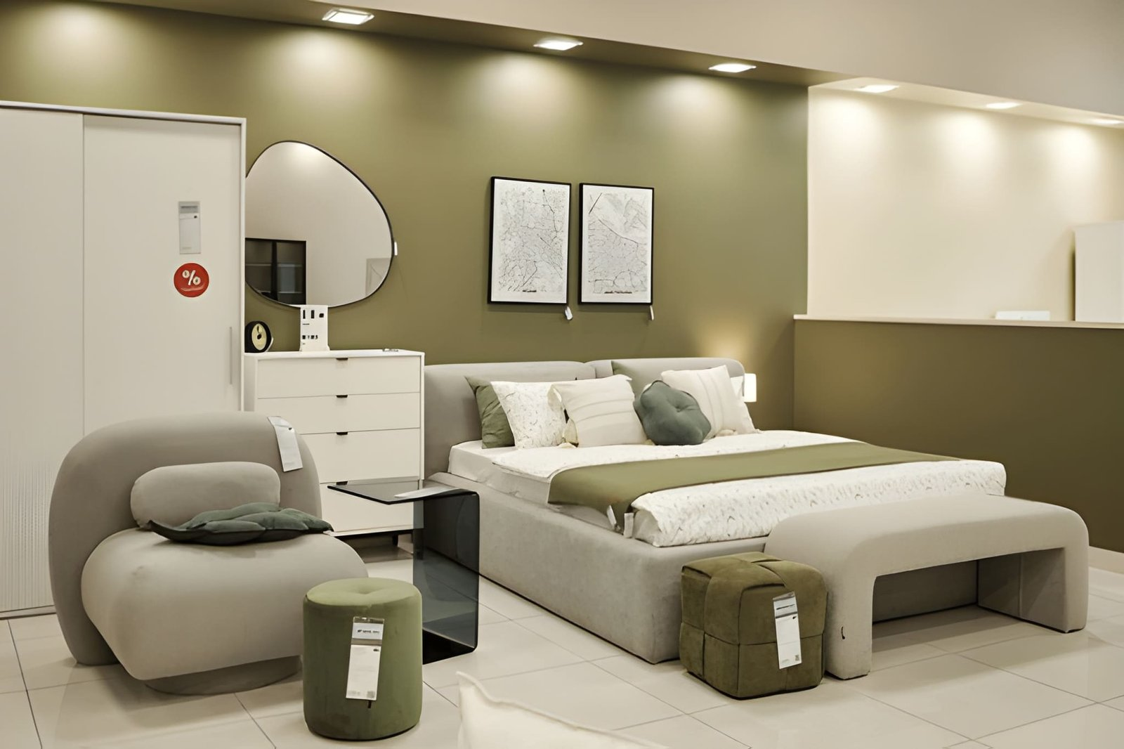
The focal point in a bedroom is almost always the bed. The rule here is simpler: the bed should face the door, centered on the wall it occupies, with matching clearance on both sides (minimum 60cm for comfortable movement). Nightstands should be at mattress height — not shorter, not taller.
What most people get wrong: placing the bed in the corner to “save space.” This breaks the symmetry, makes one side inaccessible, and removes the sense of intentional placement that makes a bedroom feel designed rather than defaulted.
For practical layout guides covering specific room sizes and Canadian home configurations, https://homesblogs.co/
breaks these principles down room by room.
The Anchor Piece Principle
Every zone created by the furniture arrangement rule needs one anchor piece — typically the largest item — from which everything else is measured and oriented.
| Room | Anchor Piece | Everything Else Orients To It |
|---|---|---|
| Living room | Sofa | Chairs, coffee table, rug, side tables |
| Bedroom | Bed | Nightstands, dresser, seating if present |
| Dining room | Table | Chairs, sideboard, lighting above |
| Home office | Desk | Chair, shelving, secondary seating |
| Basement rec room | TV unit or sectional | Everything faces or frames it |
Once the anchor is placed correctly — away from walls, oriented toward the focal point — the rest of the room arranges itself more naturally than most people expect.
What Breaks the Rule (And When to Break It)
The furniture arrangement rule doesn’t apply uniformly. Narrow rooms, very small spaces under 12 square metres, and certain architectural layouts genuinely require wall placement for some pieces. The rule isn’t rigid — it’s a default that should be questioned deliberately, not abandoned out of habit.
Legitimate reasons to place furniture against a wall:
- The room is genuinely too narrow to float furniture without blocking traffic flow
- A piece is purely decorative and not part of an active zone
- The room has an unusual shape where floating creates more dead space, not less
Not legitimate reasons:
- “It looks weird in the middle” (give it a week — it adjusts)
- “We need more floor space” (you probably need less furniture, not more wall space)
- “That’s just how furniture goes” (it isn’t)
Frequently Asked Questions
How far should a sofa be from the wall in a Canadian living room?
The standard is 45–60cm, which gives the room enough visual breathing room without creating a gap that feels accidental. In very small rooms, even 20–30cm makes a noticeable difference compared to flush placement.
Does the furniture arrangement rule work in small condos?
Yes — arguably better than in large homes. Floating furniture in a small condo creates defined zones that make the space feel purposeful and larger than its square footage. The key is choosing fewer, correctly scaled pieces rather than cramming in everything you own.
What’s the correct rug size for a furniture grouping?
Large enough that the front legs of every seated piece rest on it. A rug that only sits under the coffee table breaks the zone visually and makes the room feel disjointed.
Should all furniture in a room face the same direction?
No. Slight angles — particularly on chairs — make a grouping feel conversational rather than theatrical. The goal is that everyone seated in the zone can see each other without turning their head significantly.
The Bottom Line
The furniture arrangement rule every designer uses isn’t secret knowledge — it’s just uncommonly applied. Pull the sofa off the wall. Build a zone around a focal point. Let the rug define the boundary. Keep conversation distances human.
That’s it. No renovation, no new furniture, no design degree. Just a different starting assumption about what a room is actually for — and the willingness to move a sofa 50 centimetres.